Tuesday, June 26, 2012
Grand Canyon Gravure project
http://kck.st/LwzeJr
The goal is to collect the materials to get this project finished.
It is at it's half way point and I want to keep the momentum going!
Thanks to people who have let me borrow equipment this summer,
allowed me to find work space,
and encouraged me to keep going I think that the finish line is in sight.
Watch the video.
Click the links.
Share share share to anyone who might be interested!
(there are some really good deals for those who choose to be a part of finishing this project)
Friday, May 25, 2012
International Photography Annual #1
a book by the folks at Manifest Gallery in Cincinnati, OH,
will have some of my work in it.
I'll post details closer to the publishing date.
The planned release date is some time late September - early October
so it can coincide with FotoFocus.
will have some of my work in it.
I'll post details closer to the publishing date.
The planned release date is some time late September - early October
so it can coincide with FotoFocus.
Thursday, April 26, 2012
Wednesday, April 25, 2012
Still Point Arts Quarterly
and Still Point Gallery
Three of my pieces are currently in the online gallery for Still Point IV.
Out of that online show, several artists' work (including mine) will appear in the summer edition of Still Point Arts Quarterly, which is an artist-centered publication, on very nice paper, that includes poetry and prose in addition to visual arts.
Tuesday, April 24, 2012
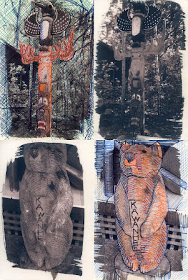
Sketchbook Tour starts in Brooklyn
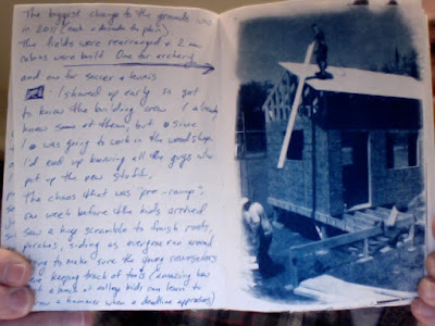
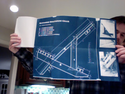
http://www.arthousecoop.com/submissions/58512-kawanhee-boathouse-chair
My sketchbook is catalogue number 156.19-1
at the Brooklyn Art Library
and will continue on across N. America,
so check the schedule and mark your calendars
May 3-5 in Chicago, IL at
Hyde Park Art Center
May 11-13 in Portland, OR at
The Cleaners at the Ace Hotel
May 15-16 in Vancouver, Canada at
W2 Media Cafe
May 24-26 in Los Angeles, CA at
iam8bit
June 2-23 in San Francisco, CA at
Pop-Up Shop
July 6-8 near Boston, MA at
LynnArts
July 11-14 in Portland, Maine at
SPACE Gallery
July 18-22 in Toronto, Canada at
The Gladstone Hotel
Aug 23-25 in Philadelphia, PA at
The Painted Bride
Aug 29 - Sept 1 in Atlanta at
MASS Collective
Sept 8-16 in Austin, TX at
Co-Lab Project Space
Monday, April 23, 2012
Elves Chasm (looking out)
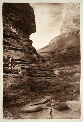
Finished the sepia edition (10) from this photogravure plate.
The sky in this picture is a very close portrayal of the typical sky from the trip last year. Overcast much of the time, but when clear the wind kicked up. This all made for some very flat light. Taking pictures within a tight canyon was good, but as soon as I turned the camera lens skyward, the meter did all sorts of crazy things. I had to rely on what I had learned about light meters, exposure, aperture a very long time ago.
Here is a link to a very cool 360 panoramic view of Elves Chasm that someone else made.
Labels:
alternative,
Grand Canyon,
photography,
photogravure
Sunday, April 22, 2012
Elves Chams (looking in)
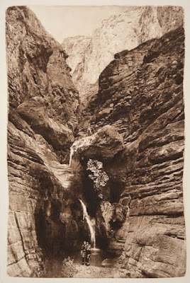
I just ran the sepia edition from this photogravure plate.
10 prints in the edition with 1 artist's proof and 1 printer's proof.
Geology of Elve's Chasm
Labels:
alternative,
Grand Canyon,
photography,
photogravure
Saturday, April 21, 2012
Deer Creek
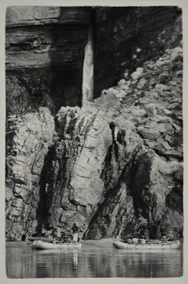
Another test print with blue/black ink from a new plate for photogravure.
http://www.zionnational-park.com/map-deer-creek
Labels:
alternative,
canyon,
grand,
photography,
photogravure
Friday, April 20, 2012
Tequila Beach

Testing the photogravure plate I just made for this image, using blue black ink on white paper. It looks good, but I think that the edition will use a warmer ink color.
(please excuse the limited range of the cell phone camera used to take the photo of this test print)
http://grandcanyonhistory.clas.asu.edu/sites_coloradorivercorridor_lavafalls.html
Labels:
alternative,
canyon,
grand,
photography,
photogravure
Thursday, April 19, 2012
Photoworks Gallery
"Alternative Visions"
at Glen Echo Park in MD
April 13 - May 7
Opening Reception April 22 from 5 - 7:30 pm
Artists/Gallery Talk from 6 - 6:30 pm
If you are in the DC area be sure to stop by to see the show.
click here for invitation
You've had the chance to preview some of these images on the web,
but there is much more to see in person.
The internet cannot represent all of the subtle work in each piece.
They need to be seen in person to be fully appreciated.
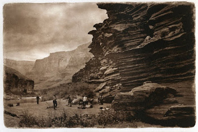 "Camp 118.6"
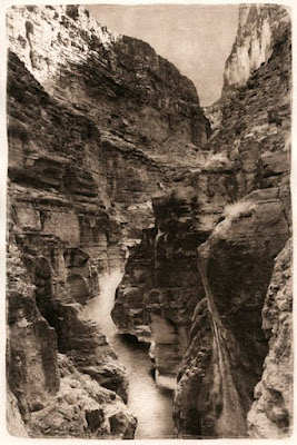
"Havasu 2"
(first public showing of this piece)
at Glen Echo Park in MD
April 13 - May 7
Opening Reception April 22 from 5 - 7:30 pm
Artists/Gallery Talk from 6 - 6:30 pm
If you are in the DC area be sure to stop by to see the show.
click here for invitation
You've had the chance to preview some of these images on the web,
but there is much more to see in person.
The internet cannot represent all of the subtle work in each piece.
They need to be seen in person to be fully appreciated.
 "Camp 118.6"
"Havasu 2"
(first public showing of this piece)
Thursday, March 22, 2012
New York Show & Sale of 19th - 21st Century Photographic Images
Stop by and see my photogravure and some other very nice work.
Saturday, March 31, 2012
at The Lighthouse
111 East 59th Street
New York, NY 10022
http://www.usphotoshows.com/shows_nyc.html
Saturday, March 31, 2012
at The Lighthouse
111 East 59th Street
New York, NY 10022
http://www.usphotoshows.com/shows_nyc.html
Friday, March 9, 2012
Digital Negatives (adjustment curves)
These are the four adjustment curves I made for cyanotype printing. I like "D" the best because it is closest to the original tonal range of my home-made 21 step wedge. It could use a little bit of tweaking, but I can use the information from the other three to adjust the curve to my liking. I can do this because I recorded everything, so have the data needed to make the adjustments.

Click on the images to enlarge them.
This composite image below shows the original digital 21 step wedge on the ends, and all of the pairs that I made using various adjustment curves. (this image converted to grayscale for comparison to the step wedge; it also has the levels adjusted to get rid of the head/foot in the histogram since the cyan color does not have a great Dmax. It's relative)

Here is the same composite in color.
Original digital image on the ends.
First pair was made with a transparency that did not have any adjustment curve. I simply took the image and hit "control - i" to inverse the image and create a negative, then printed it out on an Epson 3800. Using the transparency/negative to make the cyanotype prints revealed how far off the cyanotype process can be.

After scanning the cyanotype prints made with the non-adjusted transparency, I recorded the difference between the Input (what the gray density should be) and the Output (what the gray density really is in the process). I reversed the Input/Output numbers to make a compensation curve.
Curve A was made with the information from the original print on the left.
Curve B was made by using Curve A and smoothing it out a bit by clicking the pencil icon then hitting the S shaped icon below it two or three times.
Curve C was made with the information from the original print on the right.
Curve D was made by using Curve C and smoothing it out a bit by clicking the pencil icon then hitting the S shaped icon below it two or three times.
Adjustment curve D applied to this image.
10 minute exposure. Standard water development.
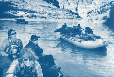
Converted to grayscale mode to see the real tonal range.
(no other adjustment)
This is the original digital image.
Even the darkest prussian blue possible in a cyanotype is not going to have the density of other processes, I think that this is about as good as I can get this process. Since blue reads a little lighter, and is difficult for the eye to see, I am going to make a few prints with longer exposure times. Having 90%, or even 85% drop out all the way to 100% black (blue in this case) would not hurt the image, and would make the tonal scale in the middle drop down to a slightly darker range that will create a more convincing image.
A very brief summary of the entire process:
1. Your workflow must be consistent. If it is not, then address that first.
2. Make a stepwedge (or gray chart) in Photoshop. Flatten the image. Invert it so it is a negative. Print it on a transparency. Use the same printer, print settings, and transparency brand/model every time. If you change one then you have changed your workflow and must start again.
3. Use that transparency/negative to print a cyanotype (or whatever process you are using).
4. Scan the resulting cyanotype with ALL color adjustments off.
5. Use a "Levels" layer to get rid of the "head" and "foot" of the histogram so you are only dealing with the information that exists and not theoretical densities in the digital world.
6. Use the "info" palette to record the difference between Input and Output. Input is what your chart says the number should be. Output is what it is reading in the scan.
7. Reverse the Input & Output numbers to build an adjustment curve.
8. Apply the adjustment curve to your original image. Flatten the image. Inverse the image to make a negative. Print on transparency. Use transparency/negative to make another cyanotype. The result should be a much better tonal range that looks closer to the original image.
A blog is not the right forum for explaining the entire process. There are too many variables. I have almost two years of off and on research into making digital negatives. I will list some of the best resources below. There are others, but the information is scattered (often in incomplete blogs like this one), and wading through some of the mythology can be a real challenge.
The links below will bring you to systems that use solid techniques based much experience. While each persons' system seems different, the core principles are the same.
http://www.digital-negatives.com/
The book and website are probably the best overview of all the concepts needed, and the book has a great set of instructions for the Quadtone RIP system that makes alot of sense.
http://www.inkjetnegative.com/images/RNP/rnp.htm
Is an excellent introduction to how different colors block UV light differently and has a link to an exceptionally useful script called ChartThrob.
http://www.danburkholder.com/Pages/main_pages/book_info_main_page1.htm
Dan's book is older, but the fact that it is still in use is a testament to the accuracy of the information and how straight forward the writing is.
http://www.precisiondigitalnegatives.com/
Mark Nelson has an exceptionally involved system that takes some time to get used to, but it works very well for Platinum printing. In my opinion, it is more involved that you need for processes that have less tonal range than Platinum/Palladium. I have seen some beautiful Platinum/Palladium prints made with this system, so it's worth a look.
http://www.alternativephotography.com/wp/
Lots of information can be found at the Alternative Photography community. They also have a Facebook group with many helpful people.
http://www.apug.org/forums/home.php
The Analog Photography Users Group is another community that has some experienced folks around.
http://www.alternativephotography.com/wp/negatives/digital-negatives-color-ratio
Clay Harmon's color ratio method.
http://glsmyth.com/MiscArticles/Creating_The_Digital_Negative.pdf
Another nice explanation of making digital negatives

Click on the images to enlarge them.
This composite image below shows the original digital 21 step wedge on the ends, and all of the pairs that I made using various adjustment curves. (this image converted to grayscale for comparison to the step wedge; it also has the levels adjusted to get rid of the head/foot in the histogram since the cyan color does not have a great Dmax. It's relative)

Here is the same composite in color.
Original digital image on the ends.
First pair was made with a transparency that did not have any adjustment curve. I simply took the image and hit "control - i" to inverse the image and create a negative, then printed it out on an Epson 3800. Using the transparency/negative to make the cyanotype prints revealed how far off the cyanotype process can be.

After scanning the cyanotype prints made with the non-adjusted transparency, I recorded the difference between the Input (what the gray density should be) and the Output (what the gray density really is in the process). I reversed the Input/Output numbers to make a compensation curve.
Curve A was made with the information from the original print on the left.
Curve B was made by using Curve A and smoothing it out a bit by clicking the pencil icon then hitting the S shaped icon below it two or three times.
Curve C was made with the information from the original print on the right.
Curve D was made by using Curve C and smoothing it out a bit by clicking the pencil icon then hitting the S shaped icon below it two or three times.
Adjustment curve D applied to this image.
10 minute exposure. Standard water development.

Converted to grayscale mode to see the real tonal range.
(no other adjustment)

This is the original digital image.

Even the darkest prussian blue possible in a cyanotype is not going to have the density of other processes, I think that this is about as good as I can get this process. Since blue reads a little lighter, and is difficult for the eye to see, I am going to make a few prints with longer exposure times. Having 90%, or even 85% drop out all the way to 100% black (blue in this case) would not hurt the image, and would make the tonal scale in the middle drop down to a slightly darker range that will create a more convincing image.
A very brief summary of the entire process:
1. Your workflow must be consistent. If it is not, then address that first.
2. Make a stepwedge (or gray chart) in Photoshop. Flatten the image. Invert it so it is a negative. Print it on a transparency. Use the same printer, print settings, and transparency brand/model every time. If you change one then you have changed your workflow and must start again.
3. Use that transparency/negative to print a cyanotype (or whatever process you are using).
4. Scan the resulting cyanotype with ALL color adjustments off.
5. Use a "Levels" layer to get rid of the "head" and "foot" of the histogram so you are only dealing with the information that exists and not theoretical densities in the digital world.
6. Use the "info" palette to record the difference between Input and Output. Input is what your chart says the number should be. Output is what it is reading in the scan.
7. Reverse the Input & Output numbers to build an adjustment curve.
8. Apply the adjustment curve to your original image. Flatten the image. Inverse the image to make a negative. Print on transparency. Use transparency/negative to make another cyanotype. The result should be a much better tonal range that looks closer to the original image.
A blog is not the right forum for explaining the entire process. There are too many variables. I have almost two years of off and on research into making digital negatives. I will list some of the best resources below. There are others, but the information is scattered (often in incomplete blogs like this one), and wading through some of the mythology can be a real challenge.
The links below will bring you to systems that use solid techniques based much experience. While each persons' system seems different, the core principles are the same.
http://www.digital-negatives.com/
The book and website are probably the best overview of all the concepts needed, and the book has a great set of instructions for the Quadtone RIP system that makes alot of sense.
http://www.inkjetnegative.com/images/RNP/rnp.htm
Is an excellent introduction to how different colors block UV light differently and has a link to an exceptionally useful script called ChartThrob.
http://www.danburkholder.com/Pages/main_pages/book_info_main_page1.htm
Dan's book is older, but the fact that it is still in use is a testament to the accuracy of the information and how straight forward the writing is.
http://www.precisiondigitalnegatives.com/
Mark Nelson has an exceptionally involved system that takes some time to get used to, but it works very well for Platinum printing. In my opinion, it is more involved that you need for processes that have less tonal range than Platinum/Palladium. I have seen some beautiful Platinum/Palladium prints made with this system, so it's worth a look.
http://www.alternativephotography.com/wp/
Lots of information can be found at the Alternative Photography community. They also have a Facebook group with many helpful people.
http://www.apug.org/forums/home.php
The Analog Photography Users Group is another community that has some experienced folks around.
http://www.alternativephotography.com/wp/negatives/digital-negatives-color-ratio
Clay Harmon's color ratio method.
http://glsmyth.com/MiscArticles/Creating_The_Digital_Negative.pdf
Another nice explanation of making digital negatives
Monday, March 5, 2012
Triptych (part 1)
I don't have any idea whether or not this will work, but here's the thought:
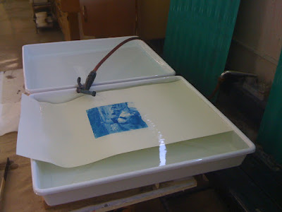
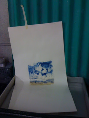
I'll make a triptych from the Grand Canyon images by contact printing on one piece of paper. The challenge is that I want to use a different process for each of the three images. Starting with the center image seemed the most logical.
I wanted to not only have a bit of split toning with this cyanotype, but I also wanted the top third to have much more red than the bottom. I remember the river-left wall at Unkar having a deep burgundy quality, with the water reflecting the sky, the wall, as well as having a slight muddy quality to it.
I used a very mild solution to bleach the original cyanotype slowly (I heard that this helps preserve some of the highlights). Instead of standing over the basin, with my hand in the air, holding the print, I taped it to the green splash board. Once the river-left wall was almost totally bleached, I dropped the print in just enough to bleach the middle for a while. Before moving the print to the wash basin I dunked the whole thing so the toning process would bring a little warmth to the entire picture.
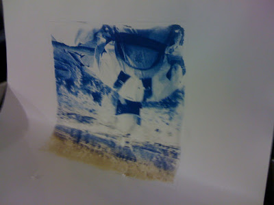
A similar process was employed during toning, bringing most of the deep red tone to the top third of the image.
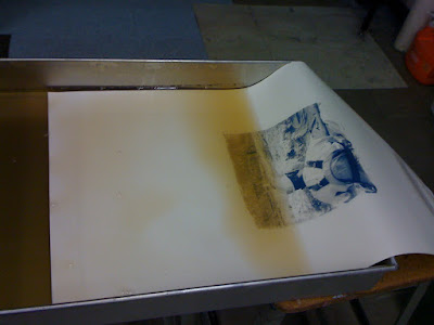
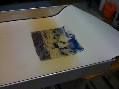
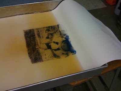
The images will be about 1 inch apart. I've left plenty of paper on the sides to allow for easy handling while printing.
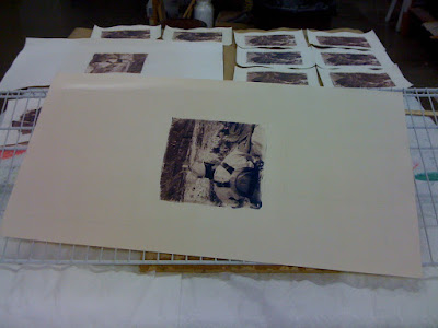
It turned out looking good. The actual image is more subtle, but this is a pretty good idea of how it looks (considering how iPhones auto exposure is strange in fluorescent light)


I'll make a triptych from the Grand Canyon images by contact printing on one piece of paper. The challenge is that I want to use a different process for each of the three images. Starting with the center image seemed the most logical.
I wanted to not only have a bit of split toning with this cyanotype, but I also wanted the top third to have much more red than the bottom. I remember the river-left wall at Unkar having a deep burgundy quality, with the water reflecting the sky, the wall, as well as having a slight muddy quality to it.

I used a very mild solution to bleach the original cyanotype slowly (I heard that this helps preserve some of the highlights). Instead of standing over the basin, with my hand in the air, holding the print, I taped it to the green splash board. Once the river-left wall was almost totally bleached, I dropped the print in just enough to bleach the middle for a while. Before moving the print to the wash basin I dunked the whole thing so the toning process would bring a little warmth to the entire picture.

A similar process was employed during toning, bringing most of the deep red tone to the top third of the image.


The images will be about 1 inch apart. I've left plenty of paper on the sides to allow for easy handling while printing.

It turned out looking good. The actual image is more subtle, but this is a pretty good idea of how it looks (considering how iPhones auto exposure is strange in fluorescent light)

Labels:
acid,
alternative,
cyanotype,
photography,
tannic,
toning
Friday, February 24, 2012
Diffusion IV
look for my work this Spring in the fourth edition of Diffusion Magazine
"Diffusion is an independent, reader-supported annual that highlights and celebrates unconventional photographic processes and photo related artwork. Diffusion strives to spotlight artists pushing the boundaries of traditional photographic processes as well as introducing new and innovative voices through articles, interviews, and image galleries.
Described as ‘a wonderful bundle of inspiration,’ Diffusion is supported by an audience of photographers, gallery directors, educators and art enthusiasts worldwide."
(quoted from - http://onetwelvepublishing.com/wordpress/about/)
Labels:
alternative,
aquatint,
artist,
edition,
essay,
intaglio,
muse,
photography,
photogravure,
solarplate,
statement
Thursday, February 23, 2012
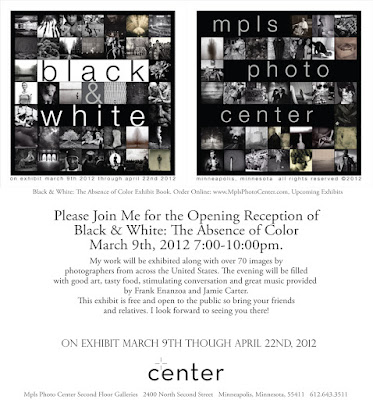
MPLS Photo Center
"Black & White: The Absence of Color"
March 9 - April 22
http://www.mplsphotocenter.com/exhibits/juror_results.php
Opening reception March 9th, 7-10pm
http://www.mplsphotocenter.com/exhibits/exhibits-information.php
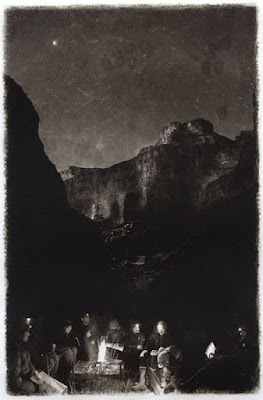
photogravure titled "Campsite Quanta"
This is the black & white version
(bone black with a little bit of thalo red mixed in)
There are 10 in this edition and
and edition of 10 in sepia
here is a link to the Flickr stream from the opening reception
http://www.flickr.com/photos/50918001@N05/6836080758/in/set-72157629584141669/
March 9 - April 22
http://www.mplsphotocenter.com/exhibits/juror_results.php
Opening reception March 9th, 7-10pm


http://www.mplsphotocenter.com/exhibits/exhibits-information.php
photogravure titled "Campsite Quanta"
This is the black & white version
(bone black with a little bit of thalo red mixed in)
There are 10 in this edition and
and edition of 10 in sepia
here is a link to the Flickr stream from the opening reception
http://www.flickr.com/photos/50918001@N05/6836080758/in/set-72157629584141669/
Labels:
alternative,
canyon,
etching,
grand,
km73,
photography,
photogravure,
solarplate
uforge gallery
"Illustration"
March 1 - 25
reception March 1st
6-8 pm
If you are in the Boston area, you are invited to stop by and see the show!
http://www.uforgegallery.com/home.php
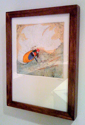
This piece is an etching/aquatint colored with watercolor.
(The one in this show is #8 in an edition of 10. About half of the edition is gone, so snatch it up if you like it)
March 1 - 25
reception March 1st
6-8 pm

If you are in the Boston area, you are invited to stop by and see the show!
http://www.uforgegallery.com/home.php
This piece is an etching/aquatint colored with watercolor.
(The one in this show is #8 in an edition of 10. About half of the edition is gone, so snatch it up if you like it)
Wednesday, February 22, 2012
Rangefinder Magazine
Labels:
alternative,
black,
canyon,
grand,
magazine,
photography,
photogravure,
process,
rangefinder,
white
Monday, February 20, 2012
Colorado Mesa University
http://coloradomesa.edu/art/index.html
February 20 - March 23
Reception on Friday, February 24
6:00 - 9:00 pm
February 20 - March 23
Reception on Friday, February 24
6:00 - 9:00 pm

Friday, February 3, 2012
Euro/Dollar print exchange
http://www.jrbham.btinternet.co.uk/edpe/
I'm taking care of the N. America side of things, so if you are from USA or Canada and would like to participate in an alternative photographic process print exchange with our friends in Europe you need to do two things...
1. Read EVERYTHING in the webpage that you will find by clicking the link at the top.
2. Send me an email with your stated interest, your process, and some kind of way to see a bit of your work (be it a website, facebook page, or even emailing me a few small jpegs of your work)
This exchange is not running on a strict schedule, but when we have enough people on this side of the ocean, I'll send everything over to Europe. So, the best strategy is to express your interest, get a print ready to go, then be patient.
Thursday, February 2, 2012
Wednesday, February 1, 2012
Tuesday, January 31, 2012
ARTSPACE GALLERY and Poconoarts
"Altered State?"
photography show
opening reception Saturday, January 14
at ARTSPACE Gallery
of Pocono Arts Council
Both of these photogravures of mine will be there. If you are in PA, stop by the show and see them in person (much better looking live than just on the internet)
 "Camp 118.6"
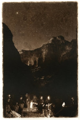 "Campsite Quanta"
________________________________________________________________
update January 15, 2012
I am very proud to announce that "Campsite Quanta" received the Juror's Choice award in this show.
Here are some links to press about the show:
http://www.poconorecord.com/apps/pbcs.dll/article?AID=/20120126/LIVING/201260324/-1/NEWS16
http://www.strausnews.com/articles/2012/01/28/pennsylvania/arts_and_entertainment/4.txt
http://forwardianartssociety.blogspot.com/2012/01/artspace-in-altered-state.html
http://www.poconoarts.org/__PApages/__alteredstates.htm
http://www.poconorecord.com/apps/pbcs.dll/article?AID=/20120113/LOCALENT/201130332/-1/rss15
http://www.poconoarts.org/__PApages/__images/newsletter/2012_01_newsletter.pdf
photography show
opening reception Saturday, January 14
at ARTSPACE Gallery
of Pocono Arts Council
Both of these photogravures of mine will be there. If you are in PA, stop by the show and see them in person (much better looking live than just on the internet)
 "Camp 118.6"
 "Campsite Quanta"
________________________________________________________________
update January 15, 2012
I am very proud to announce that "Campsite Quanta" received the Juror's Choice award in this show.
Here are some links to press about the show:
http://www.poconorecord.com/apps/pbcs.dll/article?AID=/20120126/LIVING/201260324/-1/NEWS16
http://www.strausnews.com/articles/2012/01/28/pennsylvania/arts_and_entertainment/4.txt
http://forwardianartssociety.blogspot.com/2012/01/artspace-in-altered-state.html
http://www.poconoarts.org/__PApages/__alteredstates.htm
http://www.poconorecord.com/apps/pbcs.dll/article?AID=/20120113/LOCALENT/201130332/-1/rss15
http://www.poconoarts.org/__PApages/__images/newsletter/2012_01_newsletter.pdf
Labels:
alternative,
barnes,
km73,
photography,
photogravure,
polymer,
scott,
solarplate
Monday, January 30, 2012
Illusion and Chemistry: The Alternative Process
January 10 - February 4, 2012
at The Kiernan Gallery
23 B West Washington St.
Lexington, VA 24450
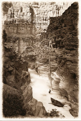
This photogravure called "Havasu" is one of the thirty alt pro images selected to hang at the gallery for this juried show. I'm very proud to have this piece hang with so many other fantastic photos in an event that showcases some particularly creative approached to photography (and image-making in general). If you have never seen any alternative process photography, or have only caught a glimpse of alt pro photo before, then you must see this show. I want you to see my photo in real life, but the show is bigger than me. There are so many good pieces to see. It's worth the trip.
http://kiernangallery.com/
at The Kiernan Gallery
23 B West Washington St.
Lexington, VA 24450

This photogravure called "Havasu" is one of the thirty alt pro images selected to hang at the gallery for this juried show. I'm very proud to have this piece hang with so many other fantastic photos in an event that showcases some particularly creative approached to photography (and image-making in general). If you have never seen any alternative process photography, or have only caught a glimpse of alt pro photo before, then you must see this show. I want you to see my photo in real life, but the show is bigger than me. There are so many good pieces to see. It's worth the trip.
http://kiernangallery.com/
Labels:
alternative,
barnes,
canyon,
grand,
photography,
photogravure,
polymer,
scott
Sunday, January 29, 2012
Cheim & Reid
547 West 25th Street
New York, NY 10001
http://www.cheimread.com/
is hosting
Postcards From The Edge
http://www.thebody.com/visualaids/current/postcards2012.html
January 6th - 8th
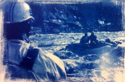
see this 4" x 6" cyanotype in the show!!!
New York, NY 10001
http://www.cheimread.com/
is hosting
Postcards From The Edge
http://www.thebody.com/visualaids/current/postcards2012.html
January 6th - 8th

see this 4" x 6" cyanotype in the show!!!
Art In A Box
is having their holiday fund raiser art show at
Masters & Pelavin Gallery
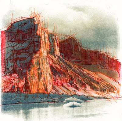
"How The Canyon Was Built"
Gel Pen over bleached Cyanotype
(approx. 7.5" x 7.5")
online auction goes live on December 16th at 12:01 am EST
and closes on December 19th at noon
Sale and Party at the gallery on December 19th (Monday)
from 5 - 8 pm
visit Art In A Box to see how they are helping children
http://www.artinabox.org/
(and find out how you can help)
Masters & Pelavin Gallery

"How The Canyon Was Built"
Gel Pen over bleached Cyanotype
(approx. 7.5" x 7.5")
online auction goes live on December 16th at 12:01 am EST
and closes on December 19th at noon
Sale and Party at the gallery on December 19th (Monday)
from 5 - 8 pm
visit Art In A Box to see how they are helping children
http://www.artinabox.org/
(and find out how you can help)
Black and White photography at Linus Gallery
see this photogravure of Matkatamiba in the show
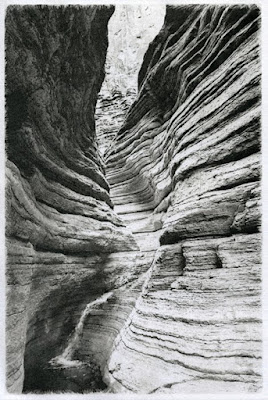
Long Beach, CA
opening reception Friday, December 9th, 5:30 - 9:00 pm
http://www.linusgallery.com/blackandwhite.html
2699 E. 28th Street
Suite 416
Signal Hill, CA 90755

Long Beach, CA
opening reception Friday, December 9th, 5:30 - 9:00 pm
http://www.linusgallery.com/blackandwhite.html
2699 E. 28th Street
Suite 416
Signal Hill, CA 90755
Fotoweek in DC
during FotoWeek at Photoworks in Glen Echo Park
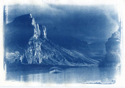
These are two of my prints from the Cyanotype Workshop with Barbara Maloney. One straight forward cyanotype and another toned with tea and coffee.

I also went to the symposium on Sunday where each presenter spoke for 30 minutes on their unique alternative process.
here is a link to the FotoWeek in DC. I wish I could have stayed for the photo slam some of the other workshops.
http://www.glenechophotoworks.org/2011/10/13/photoworks-celebrates-alternative-processes/

These are two of my prints from the Cyanotype Workshop with Barbara Maloney. One straight forward cyanotype and another toned with tea and coffee.

I also went to the symposium on Sunday where each presenter spoke for 30 minutes on their unique alternative process.
here is a link to the FotoWeek in DC. I wish I could have stayed for the photo slam some of the other workshops.
http://www.glenechophotoworks.org/2011/10/13/photoworks-celebrates-alternative-processes/
Subscribe to:
Comments (Atom)


