Showing posts with label etching. Show all posts

Thursday, February 23, 2012

MPLS Photo Center

"Black & White: The Absence of Color"
March 9 - April 22
http://www.mplsphotocenter.com/exhibits/juror_results.php
Opening reception March 9th, 7-10pm


http://www.mplsphotocenter.com/exhibits/exhibits-information.php

photogravure titled "Campsite Quanta"
This is the black & white version
(bone black with a little bit of thalo red mixed in)
There are 10 in this edition and
and edition of 10 in sepia

here is a link to the Flickr stream from the opening reception
http://www.flickr.com/photos/50918001@N05/6836080758/in/set-72157629584141669/

Friday, December 10, 2010

Tuesday, December 7, 2010

grayscale test for photo polymer gravure

Here is a grayscale from 100% - 0% black on top, and a grayscale from 80% - 20% black on the bottom.


Below are two proofs from a KM73 plate using the above image on a transparency for exposure.
Each proof is wiped slightly different.


It gives me a good idea of where the values and information drop out completely, and how smooth a transition can be achieved. Using this twin scale, I have to figure out how to eliminate the white spots. There are two types. One set in which it seems that the black area washes out. I don't know if it's residual moisture left in the transparency or if there is some other gas that is not escaping. The individually scattered white dots are a bit of a mystery to me. I'll have to re-read Jon Lybrook's page on photo polymergravure again.

-----------------------------------------------------------------

The image below is a curve test for the transparency: no adjustment to the image in the top-left spot; the 80/20 adjustment I've been using in the top-right spot, and some variations in the lower two spots.
I'm still a fan of the 80/20 curve, but it looks like the 85/15 curve would be useful for adding some contrast to very flat image that would be a bit different than just adding it in Photoshop.


same plate. the only difference is the ink wiping strategy. It's more of a feel thing. I do this to see how I'll edition an image.


This is the file I used to make the transparency/positive for the plate above.


I used a simple 80/20 curve applied over the entire image to see if I could predict what the plate would do.
This is the result.
I'm surprised by the amount of information left in the top left image. That would tell me that the dropout is somewhat higher than 80% black, therefore I can pay attention to the shadows a bit more and see what details don't have to be sacrificed.

Friday, November 26, 2010

campfire

(version 1)
vine black ink, white paper


I experimented with the contact between the positive/transparency and the plate for this one, seeing if I could get either a distressed or aged look. The result is good, but I'm wondering if I took it a bit too far. I'll make another version in cleaner conditions, and with better contact to see if a more clear image still holds up and gives the desired effect.

I'm looking to elicit the feeling of an old tradition by taking an image of a gathering from this past year and developing it with an older process of printing. Experimenting with some warmer black ink and some dark browns (perhaps even a some kind of sepia tone), and an off-white print paper might help signify age and tradition.

(version 2)
dark brown ink, white paper


(version 3)
dark brown ink, off white paper


(version 4)
new plate, vine black ink, white paper

Thursday, November 25, 2010

Alternative Photography

Has made a web page for me to showcase my completed images, using the polymer photo gravure process.

http://www.alternativephotography.com/gallery/v/scott-barnes/

I am very happy that my work has developed enough to be accepted into this community, and am flattered that they have made a page for me.

Here is a descriptive quote from the header on the alternativephotography.com website:
"Historical photographic methods in use today - the art, processes and techniques of alternative photography"

There are too many unique techniques to list on this blog. Please enjoy my work, but you are also encouraged to explore the Alternative Photography website and look at the engaging work by other artists using varied historical photographic techniques.

Sunday, November 21, 2010

Keep Paddling (the river keeps moving)

working through frustration, to emerge on the other side...

The photopolymer graveur process has become frustrating. I don't know whether I've become more demanding, with a more finely tuned eye for detail, or I'm just hitting some sort of sophomore jinx with a new process. Perhaps some things are not working right this week. I'm encouraged by some of things I've learned while making mistakes, but frustrated that the final result is not right. The photopolymer graveur process is still new to me, but screen printing is not. I've made three attempts at one image with a screen today, with poor results.

I have three options.
1. Should I give up completely?
2. Should I take a long break and come back to the problems later?
3. Should I keep pushing forward, finding a way to turn anger and frustration into determintation?

I am a fan of option #3. It is one that I naturally follow, and a belief that my experience on whitewater (and other outdoor activities) has reinforced. The river will not stop moving. I will make mistakes along the way, but I need to forget them immediately after they happen and keep moving forward.
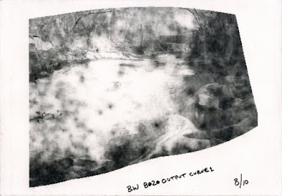


I'm inspired by some of the students in my studio classes. Their frustrated learning curve is palpable, particularly when I hear them let out a big sigh, drop their shoulders, and look away from their drawing. What has encouraged me so much, lately, is the frequency with which the return to their work, trusting the process of looking/drawing/looking/drawing/etc. Their faith in the process, and belief that they will make progress, moves me forward in my own work, and give me faith that I, too, will make progress.

Beginners mind...
_______________________________________________________________________
update (Oct. 15)

made some progress with the photo gravure
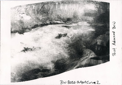


solved the contact problem, mostly...
I admit that I was not as clean as I should have been, so the three pieces of dust tented the transparency enough to lighten up the right side, BUT everything else is looking pretty good, so at least the work flow is good now.

downside is that I still can't make a screen for anything....
I've done so many of these that I can't figure out what I am doing wrong.
It will wait for the weekend. I need a break for now.

_________________________________________________________________________

update #3:
I have not liked the overall image, and did not trust how much information would be lost with the gravure process, so I decided to do alot of burning and dodging in photoshop. This was all done while clicking the preview filter on and off to predict results.
After a while I decided, since nothing was working perfectly and this was becoming an experimental piece anyway, to push the burn and dodge to extremes, betting on anything above 80% and below 20% blowing out to pure black or white.
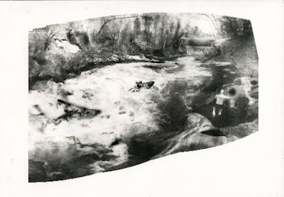

My guesses were about half correct. I pushed it a bit too far, and the image is awkward. But, the extreme example is a good way to learn, and I will keep this one for future reference.
________________________________________________________________________

update #4:
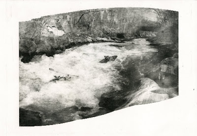
This is a good image. Adjustments in Photoshop improved the image. I am learning how the preview curve actually relates to the final product. The transparency/positive was good. The only problem with this plate was a lack of good contact in the lower right corner. I'll clean the glass on the exposure unit and the print frame before plate #5.

_________________________________________________________________________

update #5:
This is the final image.
Contact with the frame was good.
I dried the transparency with a hair dryer to make sure it did not contain any moisture.
I had taken the advice of a friend and sprayed the back of my positive/transparency with matte medium to eliminate Newton's Rings. The same person discovered why baby powder was useful in this process. Brush it on the plate, then brush it off. The super thin residual film of talc will create just enough space for gas and water vapor to escape during exposure. Talc is fine enough to not act like dust and create exposure issues. I imagine that using baby powder would make my results even more predictable.
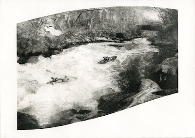


I will edition this plate.
The next step is to figure out which tone paper, and what color ink I will use for the edition.
_________________________________________________________________________

Here are the plates in order, for easier comparison.


http://artandwater.blogspot.com/2010/06/photopolymer-graveur-curves-preview-in.html

http://artandwater.blogspot.com/2010/04/solarplate-etching.html

http://artandwater.blogspot.com/2010/04/photo-polymer-gravure.html

http://artandwater.blogspot.com/2010/05/plate-decisions-and-editioning.html

http://artandwater.blogspot.com/2010/05/photopolymer-aquatint-grayscale-test.html

http://artandwater.blogspot.com/2010/05/variety-in-three-editions.html

http://artandwater.blogspot.com/2010/05/better-look.html

Wednesday, June 9, 2010

adjustment curves as preview for Photopolymer Graveur

this is just the beginning (because I am just beginning)...
below is the original digital image collage, converted to grayscale, but otherwise untouched/unadjusted

photopolymer graveur (aquatint, "safe" etching, whatever you call it) will drop out values above 80% and below 20%. In other words at those points the value will go right to black or white. So, the grayscale really only runs between the two, in the middle ground, and is not subtle at all towards the end of the scale. (I have been told this is mostly true for the original Photo Graveur, and had to be addressed. Difference in this process is that most of the adjustment is on the computer and not the development process)

I have seen a couple of curves claiming to solve this issue, but they (in my opinion) only work at the cost of some variety in the middle of the scale. I suspect this is because they are trying to bring up values that are not there.

The best thing I have discovered (to date) is the simple idea of getting a reliable preview. No matter how much you adjust your image, it is difficult to guess how much information will be lost. So, when you think you are ready to go, I'd suggest adding on more adjustment layer, and moving the sliders over from 0 to 20, and from 100 to 80. Check out the results...
below is the adjusted image: it is the first (above) image, with the curves adjusted at 20 and 80 as a way for me to preview my results from the polymer plate.


below is the actual printed image from a KM73 photopolymer plate.
There is a bit of information loss in the scan, but this is a pretty representation of what it looks like.


To clarify:

Top image is the original, and the one I printed on a high quality transparency (Pictorico), and used to expose the KM73 photopolymer plate.

Middle image is the top image, with an adjustment layer (Curves) over it, sliders moved from 0 to 20 and from 100 to 80 to get a preview of how the image will look from the KM73 plate, knowing that information is lost above 80 and below 20. It is only a way to get a sort of soft proof, to make sure I am on the right track.
No matter how I adjust the image before printing to the transparency, I want to do this preview before printing to see if it will be satisfactory.
BE SURE TO UNDO THIS STEP BEFORE YOU PRINT!!! It is a preview technique only.

Bottom image is printed from the KM73 polymergraveur plate onto Rives BFK white paper with Graphic Chemical Vine Black etching ink.

For those who have yet to discover this process (or have only just heard of it), here is a nice overview by someone else
http://www.alternativephotography.com/wp/processes/photogravure/photo-polymer-gravure-the-whys

Tuesday, May 18, 2010

edition variations

since this is pretty new and experimental (at least to me) I've been starting small editions from one plate then having to move on to other things, leaving the paper to rebound. Therefore, when resoaked, it stretches differently and makes registration of the next plate next to impossible.
I did a run of about 12, matching the same sized second plate as best as possible. (image on right)
Next, I cut down that second plate, changed the ink color and ran an edition of 10. (image in center)


I liked the play with overlap and small shift in scale, so decided to cut the plate on the next run with a bigger edition of 20. (image on left)
A note about this last image... the line drawing plate was the one that was cut down and printed second; the opposite of the other two images. The larger "background" color does recede because of the design, but the scale of the two plates makes it appear to advance a bit. I enjoy the slight confusion between scale and overlap.

There is one more plate that will get involved with this series.
I think I may leave one of the editions as it is now, but the other two will get at least one more color.


and just a fun photo showing plates in post exposure to make sure they are fully cured...

Aquatint Test on Polymer Photo Intaglio plates

Wanting to see the difference between thin plates (from Takach Press the KM Photopolymer plate is .017" thick) and medium thickness plates (from Boxcar Press the KM 73 Photopolymer plate is .030" thick ), thinking that the thicker plates might have a more forgiving and fuller grayscale range.
Also wanted to see how much darker a shorter exposure would be.
Here are all the images in order of printing. (number and info is below each image)


image #3 from KM photopolymer plate from Takach Press
10' stocastic screen aquatint exposure and 10' image exposure


image #5 from KM photopolymer plate from Takach Press
10' stocastic screen aquatint exposure and 8' image exposure


image #7 from KM photopolymer plate from Takach Press
10' stocastic screen aquatint exposure and 6' image exposure


image #9 from KM73 photopolymer plate from Boxcar Press
10' stocastic screen aquatint exposure and 10' image exposure


image #11 from KM73 photopolymer plate from Boxcar Press
10' stocastic screen aquatint exposure and 8' image exposure


image #13 from KM73 photopolymer plate from Boxcar Press
10' stocastic screen aquatint exposure and 6' image exposure


image #15 from KM73 photopolymer plate from Boxcar Press
10' stocastic screen aquatint exposure and 5' image exposure

Friday, April 23, 2010

Solarplate Etching

technically, the plates I used are KM photopolymer plates
http://www.takachpress.com/access/tyobo.htm
the solarplate brand is also available from Takach Press
I'll have to try those as well


Encouraged by good results on Monday night, I went back to the exposure unit and made four plates.
The top one is inked with Charbonnel Etching Concentrated Blue. The range in the plate is good. I think I will change the color since this is the first plate to be printed, and with be the background. (probably some kind of green) I also will experiment with a couple of different off-white and ochre papers.


I decided to test the rest of the plates with black, to make sure I would get the saturation I wanted in a color plate. Testing with black ink on white paper makes judging value very easy. And, if the color is not working out later, at least I know its an ink problem and not a plate problem.
This one will be some kind of lighter blue, and fairly transparent.


This is the main image. It will remain black. No matter how subtle I can get the aquatint, I still have a preference for some kind of strong-handed graphic-looking image in the picture.
Technically, this is still an aquatint style plate. That just allows any width line that I want. I am pleasantly surprised by the variety of line I can get, from super delicate, almost disappearing, to very bold.


This last plate is going to be the top layer of ink. It will be a transparent white. (the black part will be white, so you have to image this image in reverse)
Since everything underneath will be a dark or middle value, (and the paper is not white) I'm curious how transparent the white will have to be. Much of the underlying image may already show through with very little transparent base mixed into the white.

Photo Polymer Gravure

I've been looking to try this process for a couple of years and tonight a few of us got the process to a semi-predictable work flow with the equipment available at school.

Here is a nice quick blog post from someone else discovering this technique
http://suzannerevy.blogspot.com/2009/01/photo-polymer-gravure.html

I'm excited to do more and will post the results when I have an image beyond the first few test images we made tonight.