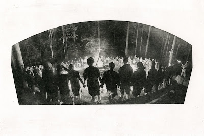
vine black ink, white paper

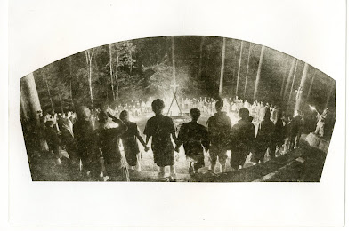
I experimented with the contact between the positive/transparency and the plate for this one, seeing if I could get either a distressed or aged look. The result is good, but I'm wondering if I took it a bit too far. I'll make another version in cleaner conditions, and with better contact to see if a more clear image still holds up and gives the desired effect.
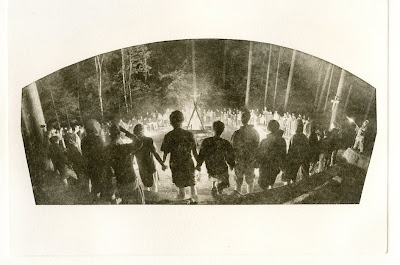
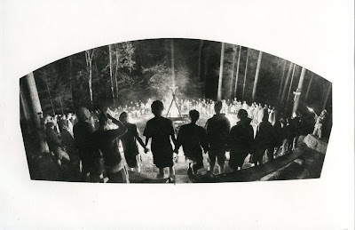
I'm looking to elicit the feeling of an old tradition by taking an image of a gathering from this past year and developing it with an older process of printing. Experimenting with some warmer black ink and some dark browns (perhaps even a some kind of sepia tone), and an off-white print paper might help signify age and tradition.
(version 2)
dark brown ink, white paper

(version 3)
dark brown ink, off white paper

(version 4)
new plate, vine black ink, white paper

No comments:
Post a Comment